
Malice In Wonderland
As the Lead UX Designer, I was tasked with refactoring existing menus in order to address previous player pain points. I also felt I could add visual flair and feel to each menu to elevate each menu to an experience.
Client
Slyglass Games
Role
Lead UX Designer
Team Size
24-28 People
Project Overview
Concepting
Coming onto the project, I went through player feedback and picked out some issues regarding our ability and augment selection screen.
Inter-Disciplinary Considerations
Our abilities and augments are given to the player by certain characters. By working with the character art team and narrative designers I worked to ensure each menu felt like its associated character.
UI as an Experience
Great UI shouldn’t be just a menu, they should feel like full experiences that elevate the player experience. This can be done by integrating animations and unique forms of feedback to increase user satisfaction while keeping usability high.
Previous Ability and Augment Select Screen
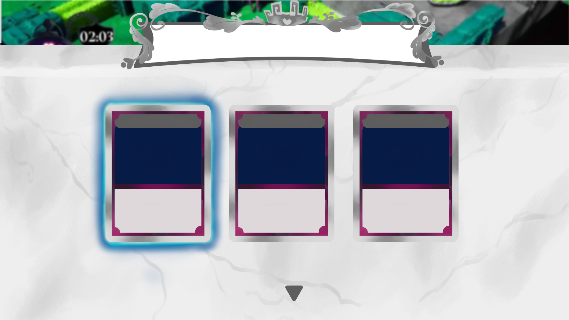
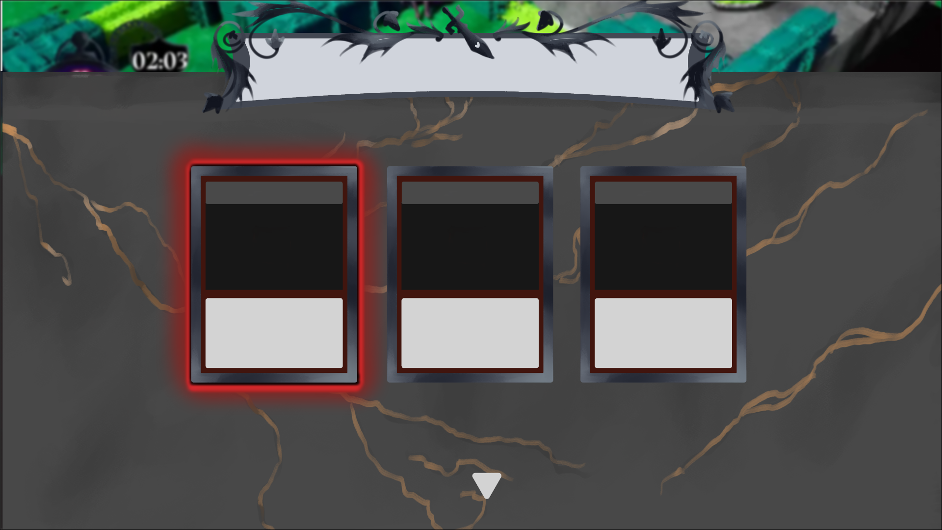
Before coming onto the project for UX, these were the previous iterations of the decree menu and ability select menu respectively. From a player experience side, they didn’t immediately read as two separate menus.
Goal
Shapes
Augment Selection Screen
Color
Ability Selection Screen
“As a player I want to immediately be able to recognize whether I am receiving a new ability or an augment.”
How Do I Differentiate A Player-Facing Menu?
Animation
Ability Select Screen
Augment Select Screen
Concepting
Shapes
Changing each menu choice’s silhouette immediately changes the feel of each menu, already making them pretty visually distinct.
“Alice’s abilities are a manifestation of her own capabilities and feelings on Wonderland.”
Alice’s Character Pillars
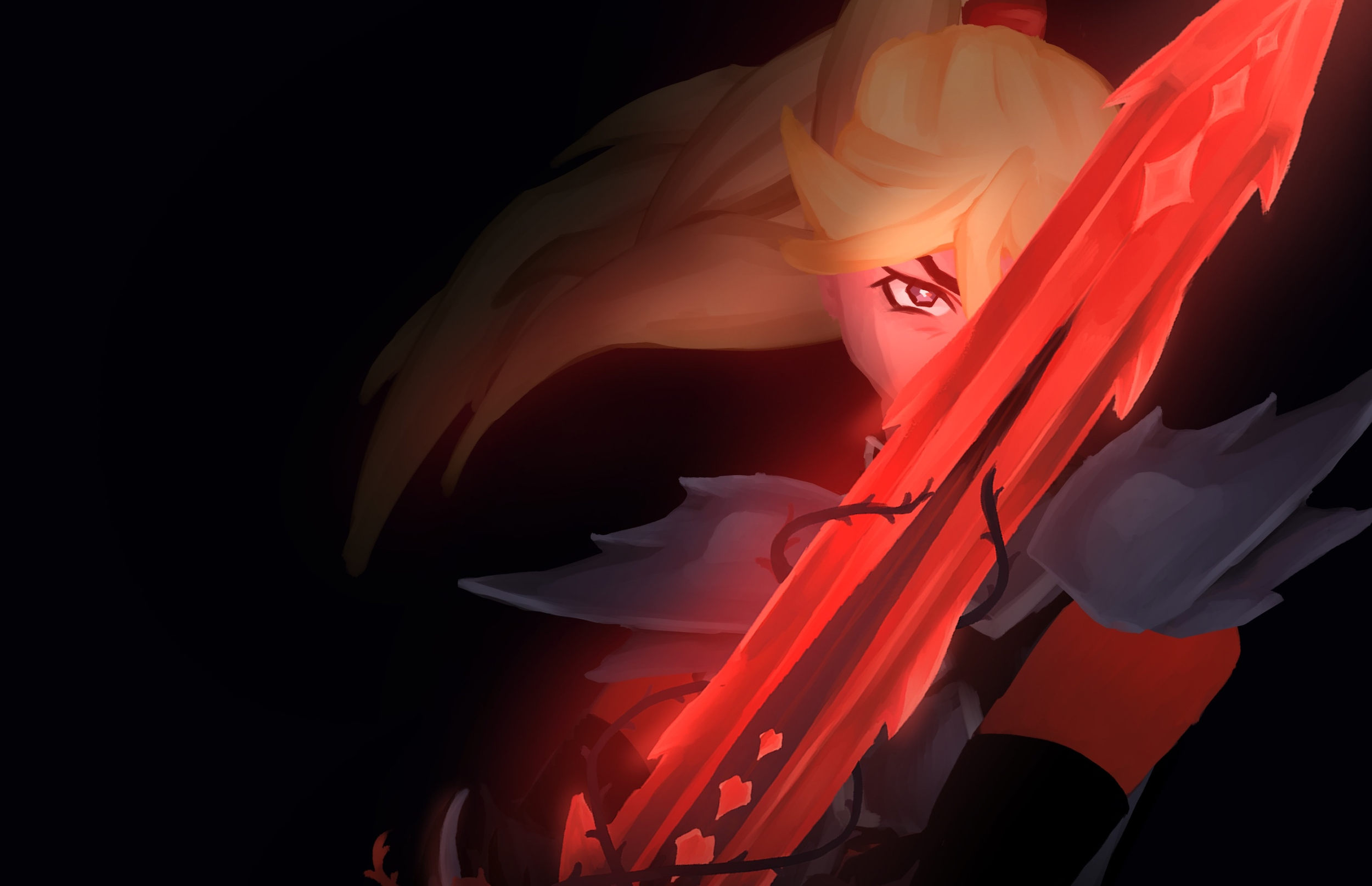
Alice Liddell © Slyglass Games
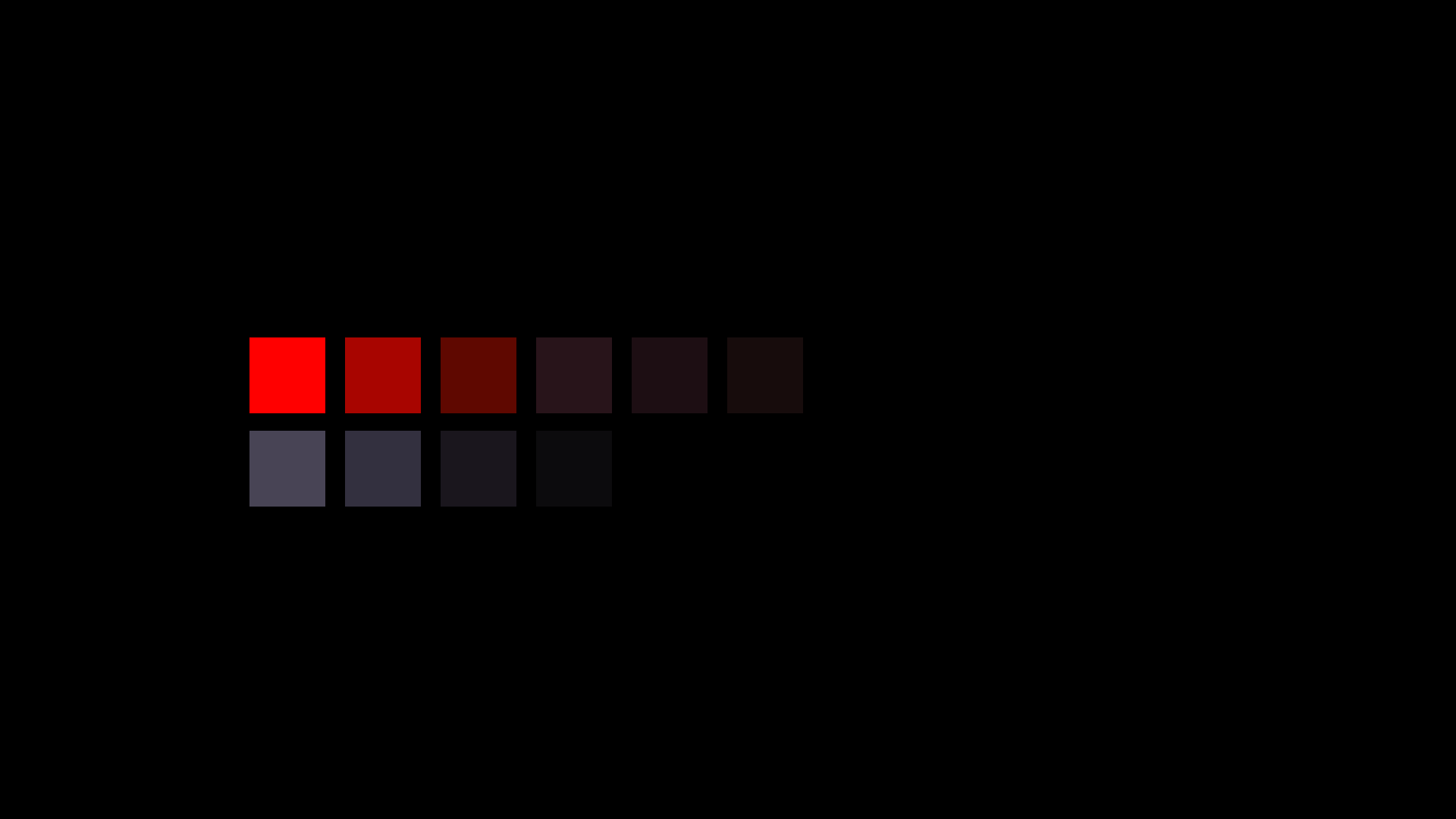
Alice’s Color Palette
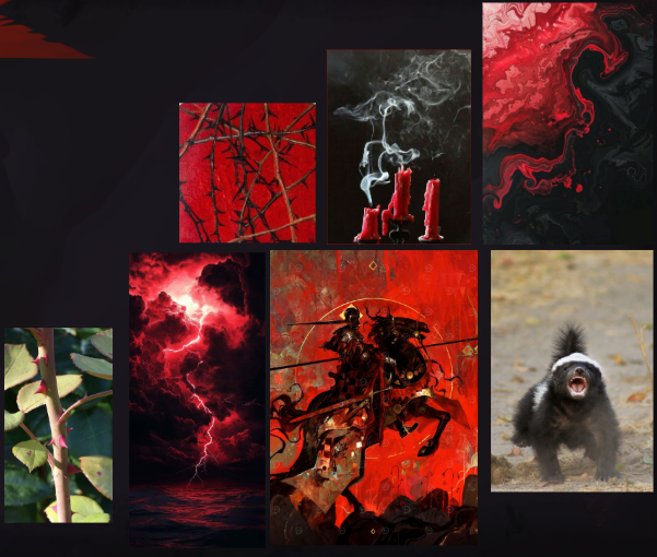
CONCUSSIVE
LITHE
FORCE OF NATURE
Alice’s Iconography
How can I design a UI menu that feels like Alice?
Early Figma Iterations
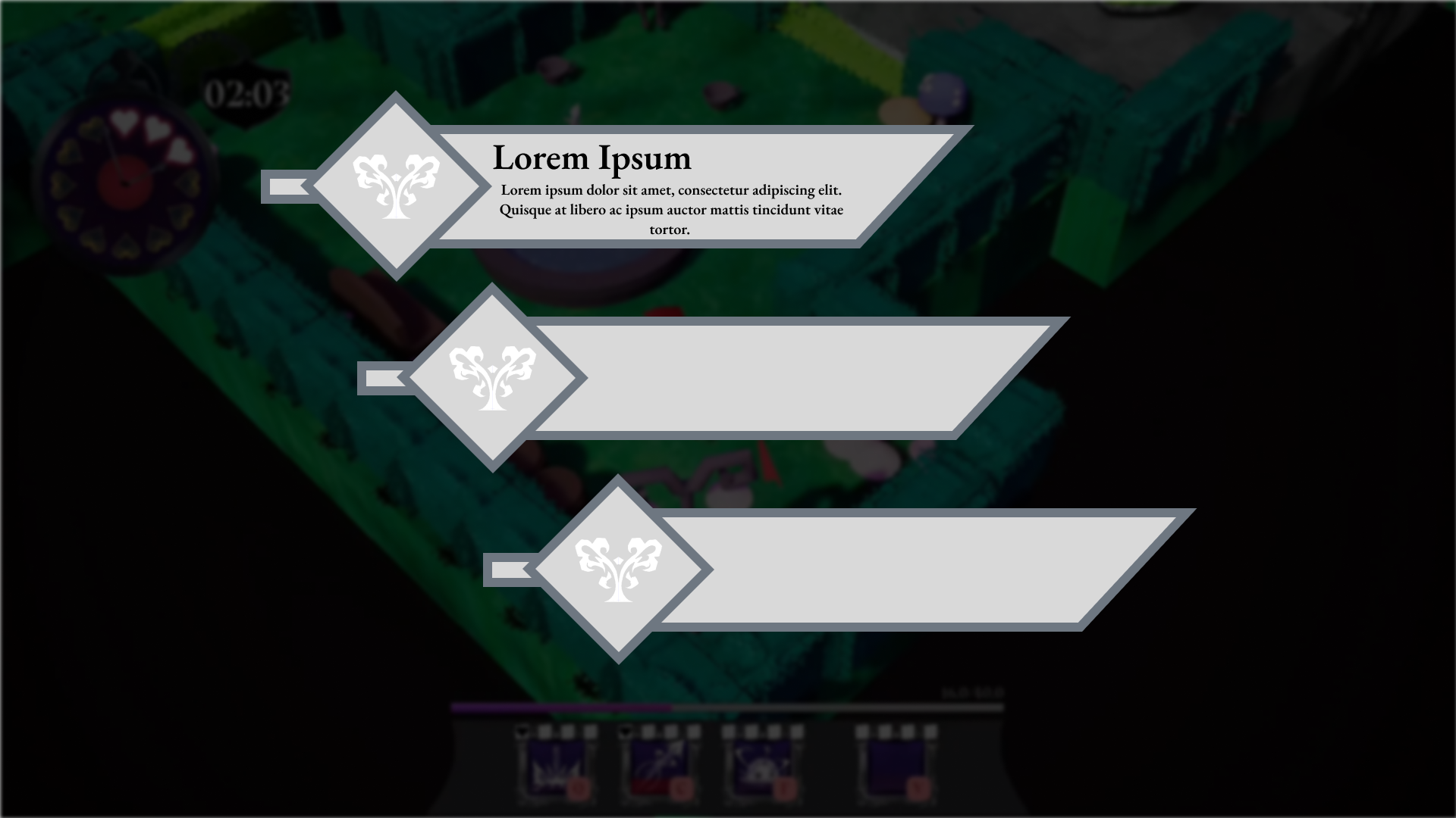
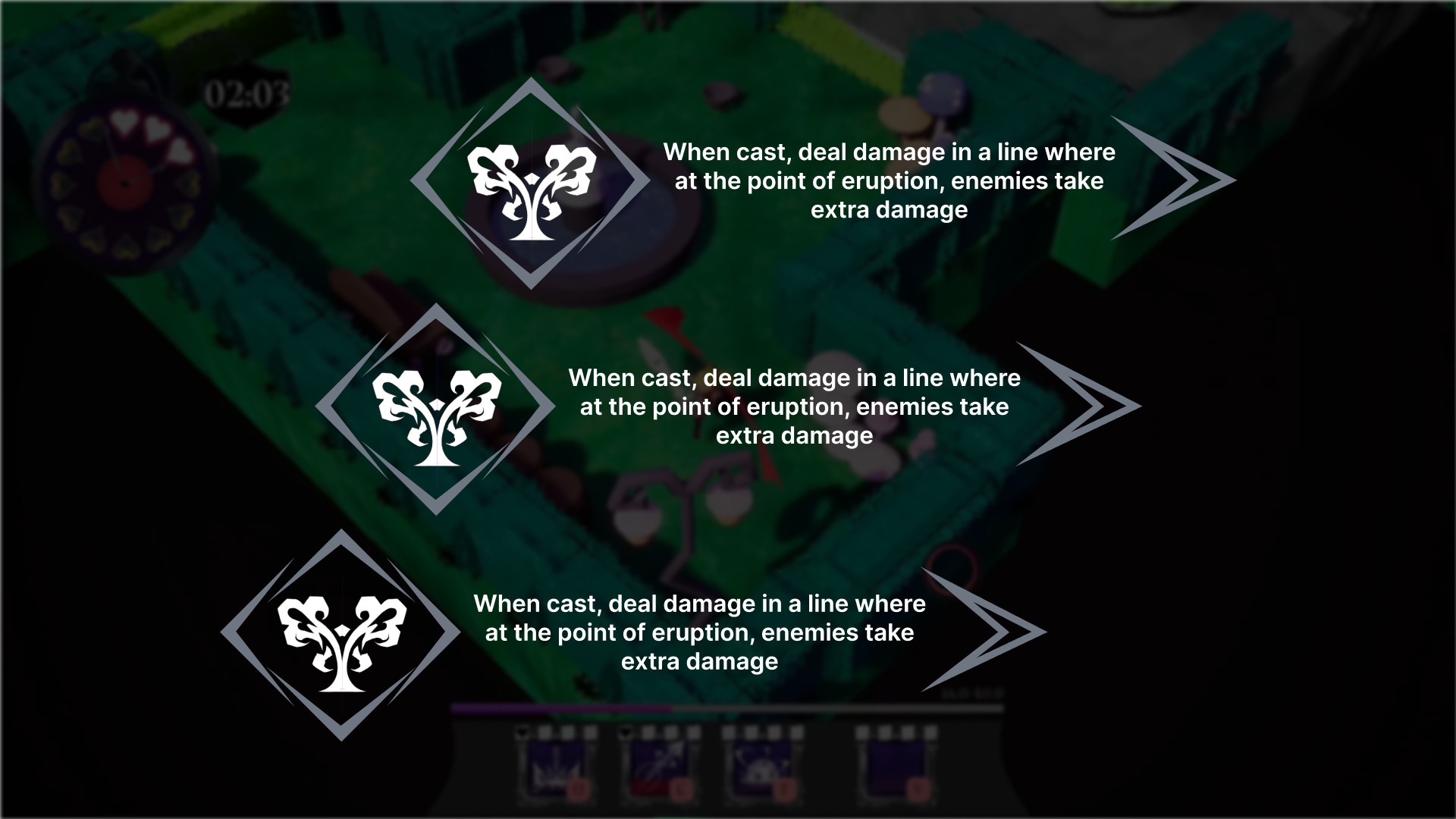
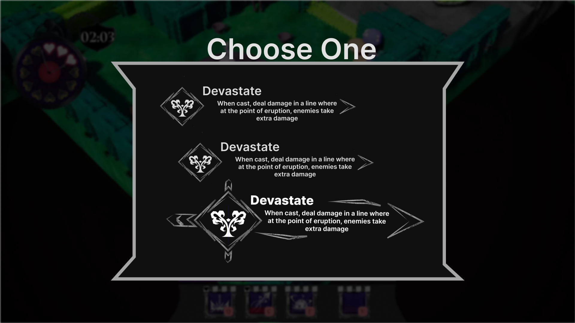
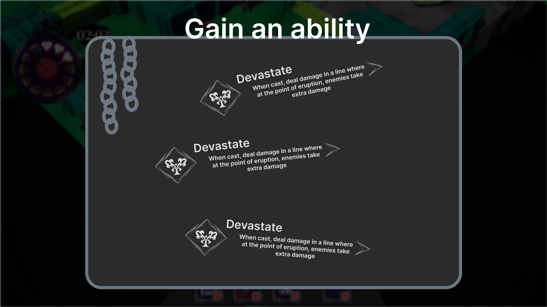
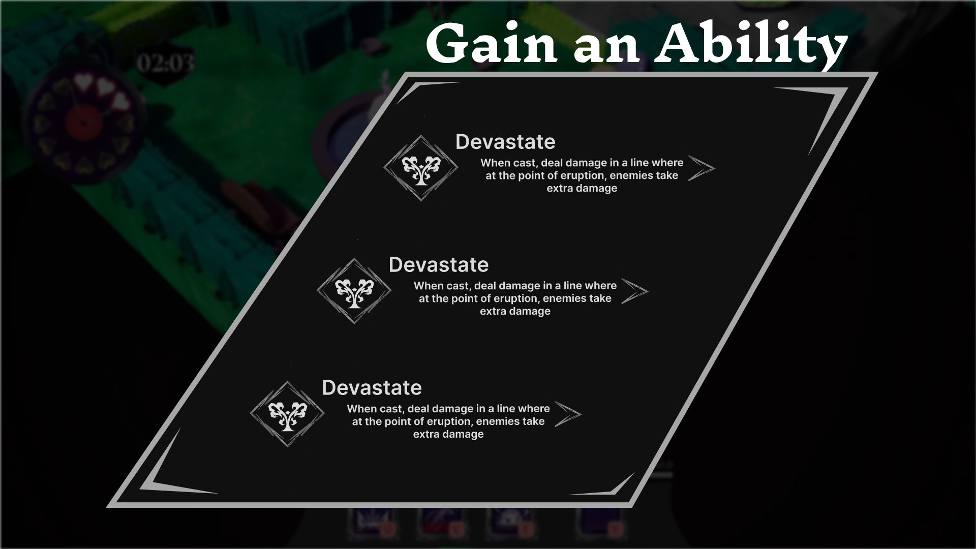
Most notably, I gravitated towards Alice’s sword as the key iconography for this menu. Making things feel sharp and lethal was the biggest goal, I then thought how I could accentuate that fantasy. When in a non hovered state ability choice buttons look like simple buttons, but after hovering it turns into a sword, as if the player is unsheathing it.
Difference of Shape: ✔
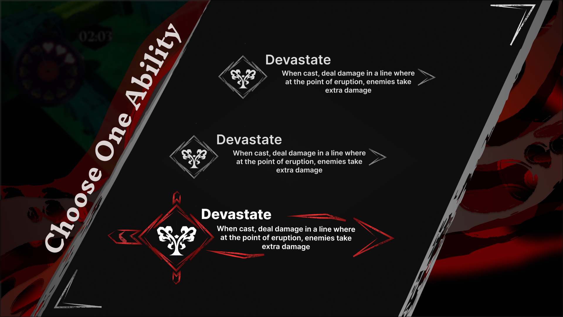
Final Look For Ability Menu in Figma
With the added colors and background decoration, the menu was ready to be put into engine.
Special thanks to Alice Mikhaylyuta (Our UI Artist) for creating the vector art in the background)
Difference of Color: ✔
In Engine Implementation
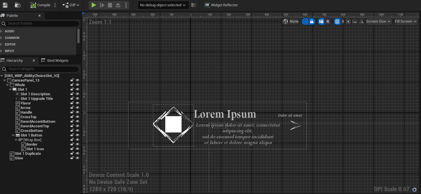
Each Ability Choice uses the same base WBP.
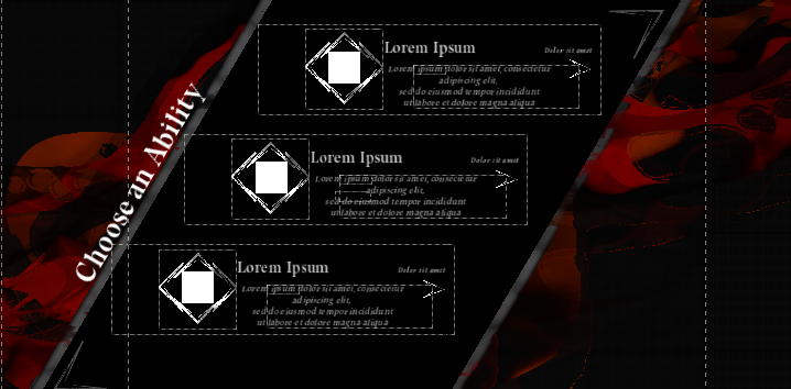
Ability Choices are put into a Vertical Box, allowing even padding and spacing in the menu.
Final Product
Going back to Alice’s Character Pillars (Concussive, Lithe, Force Of Nature), I wanted to communicate these feelings and power through entrance animations and button feedback.
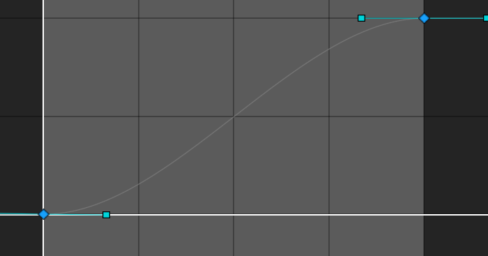
Using Unreal’s Blueprints I was able to create a system that lerps key values such as transform, color, etc. when told to and over a certain amount of time. For additional customization I added support for custom easing using Curve Tables.